A look at how a small team of designers and I put together a reusable component library for Sky Vegas.
Sky Vegas’ UI was becoming quite fractured with the many different designers and developers bringing the front-end to life. There were multiple instances of the same component looking slightly different from each other, and being used in various ways.
A team of four designers was formed to be responsible for the creation of the design system. Whilst the whole team would have input to it, it was decided that only a few of us should be responsible for it, allowing us to streamline decision making and quality control.
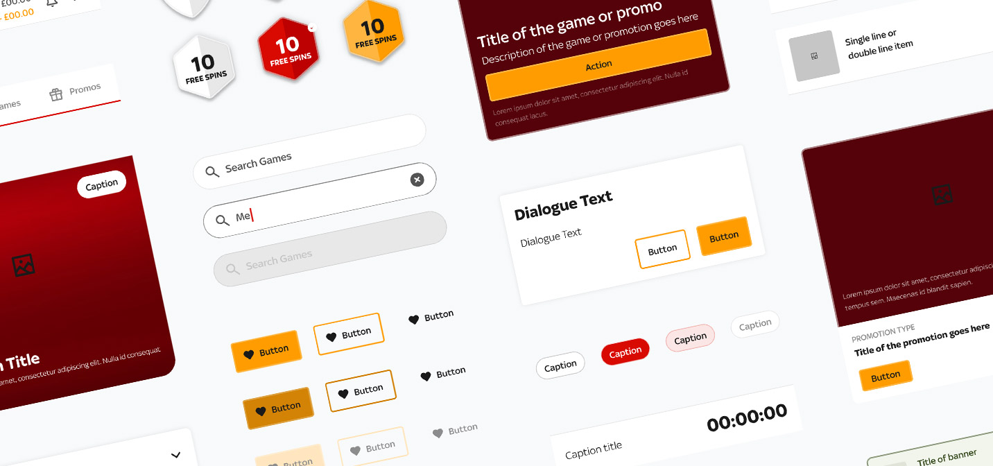
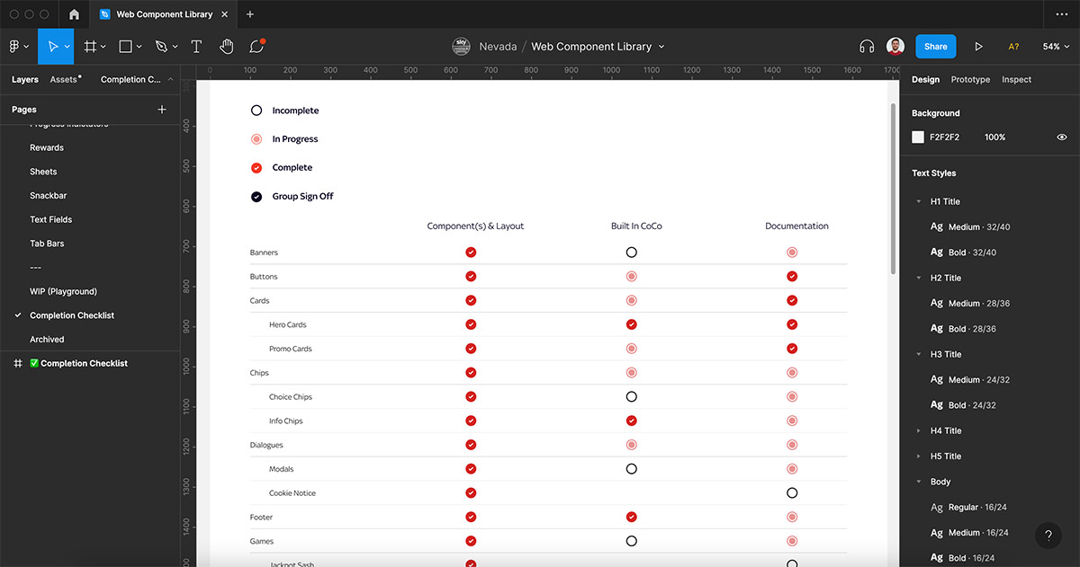
We did an audit of the existing site to see which elements were most problematic with regards to consistency, and where there were UI elements we could consolidate into reusable components. A checklist was built to keep track of them. This was made in the same Figma file in which we intended to build the components, so everything we needed was all in the same place for convenience.
A weekly meeting was set up between the designers and UX engineers in order to maintain alignment. In each meeting we’d discuss which components we’d designed that week, and show them to the UX engineers for feedback. It was important that they had early sight of our designs, so they could point out any potential problems they might forsee in the build phase. Likewise, they would show us any components they’d built so we could give them sign-off.
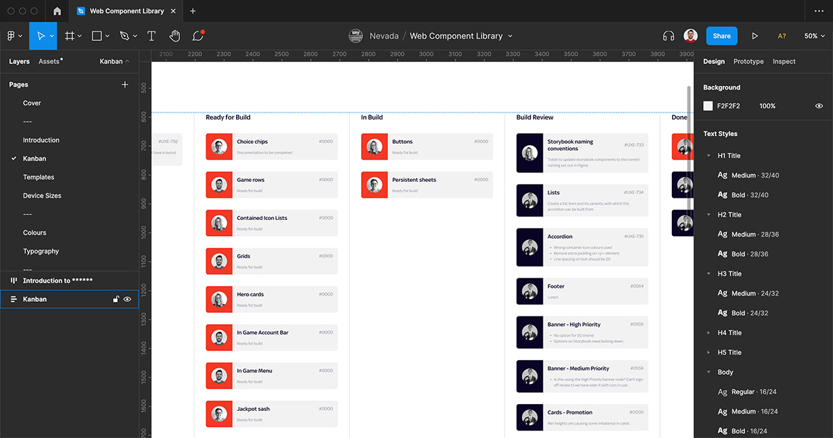
As this went on and the component library grew rapidly, it became apparent that the checklist wasn’t giving us everything we needed to keep track of it all. I put together a kanban board in the Figma file so that we could see who was working on which components, and at which stage of development they were.
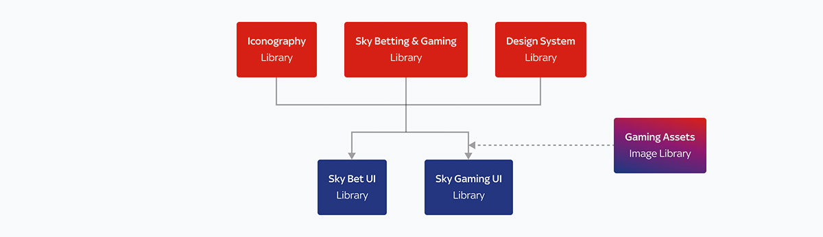
Even though we started by just creating this design system for Sky Vegas, we knew it had the potential to be shared with other products, including Sky Bet, which sits in a different tribe. This meant we needed to structure it in a way that was future-proofed for growth.
So rather than have all elements contained in one file, a master library was formed that would house all the common UI components (such as logos, typography, and colours) and all other libraries would pull from that.
A separate library was created for icons to keep them brand-agnostic. We wanted our design system files to all follow the same formatting, so another library was made for internal-use components.
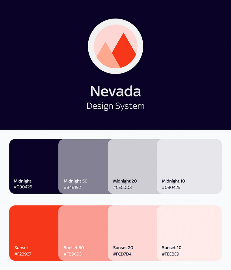
Giving the design system a name would help people throughout the business talk about it, which in turn would build its reputation as an essential part of the product’s ecosystem. We went with ‘Nevada’ for the gambling association.
Giving it it’s own visual identity to use in all the documents helped solidify it as a product in itself.
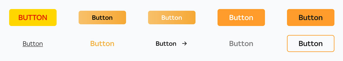
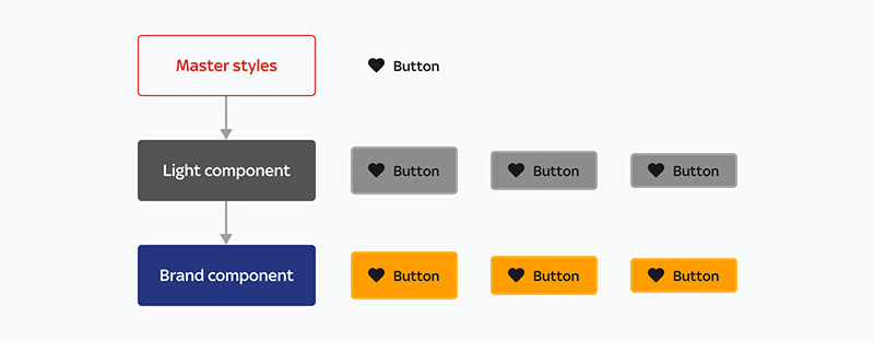
To maximise efficiency, components were structured with master components. This meant that if any changes were to be made across components of the same type, only the master would need to be changed, and the rest would follow suit.
An unbranded component (which we’ve called Light) also exists to use in wireframes and prototypes.
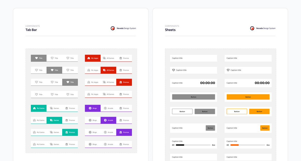
Explanations for each component and how they should be used were made directly in the Figma file, for ease of use and to maintain a single source of truth.
Because the UX engineers were kept in the loop so frequently, handover was remarkably smooth. We found that they’d often experimented with building various components they’d seen us designing to see if they were going to work before we got to the handover phase.
The components were being built in Storybook, which meant they could display the specific Figma page for each element right in the browser - allowing any developers who were using it to see our documentation alongside it. This ensured that our components maintained integrity even when being used by a team that we weren’t close to.
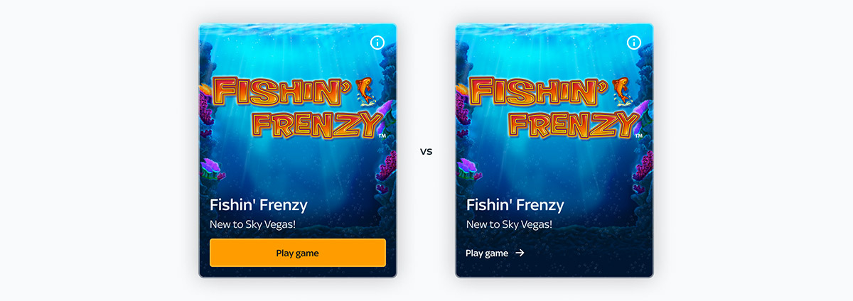
Each component would get launched alongside a new site feature, meaning we could use A/B testing to show variants and see which had the better engagement. For example, we found that hero cards with a full-width CTA button were more enticing to users than ones with less prominent ghost buttons.
Once we’d found which one resonated with our users best, we’d discuss our findings with the product manager to get final sign-off, and updated Figma and Storybook accordingly.
Use a small team to build a design. Keeping headcount low allowed for quicker decision making, and made it easier to keep documents consistent.
Consistent communication is key. Keeping everyone updated helped us spot potential problems early on, and prevented the project from stagnating.
Always keep scale in mind. Now that the Bet team are looking to build their design system too, we’re really glad we structured ours in a way that allowed for us to all share common components. It’s saved a lot of re-do work.
Keep all documentation right next to the components. Having everything in the Figma file meant we only ever needed to make updates in one location, saving time and preventing fragmentation of information.
Nest components where possible. Updating UI elements with several variants is so much faster when they all pull from the same parent.